I. Design Process
Problem definition
Design a companion app for the digital viewing of performances
PlayHouse was conceived as a web application to centralize streaming of entertainment venues, particularly theatres and concerts. However, this business model proved to be infeasible due to legal and partnership constraints. This caused the clients to pivot and redefine the purpose of their product. PlayHouse identified their target audience to be frequent performance attendees.
Early interviews indicated that digital performance attendees had two primary unmet needs :
1/ An easy, fun way to keep track of their favorite venues
2/ A way to emulate the social aspect and excitement of physical venues.
My team’s challenge was to define the organization of the PlayHouse venues with an empathic design approach that channeled the feeling of attending an in-person performance.

Ideation
Creating a playful, immersive dashboard to track venue info
To address the goals of the product, our team proposed two features:
1/ A curated PlayHouse dashboard, where users can easily access information on their favorite venues
2/ An interactive program structure with a built-in live chat function.
The program would allow venues to upload information about their shows and allow users to chat and interact during performances. From tabs on the home screen, users would be able to view the dashboard, save shows, and explore new venues.
We then ideated a number of structures to represent the user's saved venues, starting with toy blocks and blocks on a street. The blocks proved too small to fit all the necessary venue information, so I came up with the idea of a floor plan as the venue organization and prototyped it in Figma.

I thought the implication of space and physicality was a fun and experiential way to build the PlayHouse, and the 2D layout of rooms was appropriate to fit the venue information. The client agreed that the floorpan would best meet users' goals, so we proceeded with the floorpan design.
information architecture
Channeling play and engagement through metaphor and users' mental models
From the homepage, user can navigate to the venue page with information updated by the venues. After the initial iterations, I realized that users with a large number of saved venues may end up with very large and unwieldy floor plans. Therefore, I added a “floor” organization feature to the dashboard, allowing users to group their venues.
To build and update their personalized floor plan, users can enter “edit mode.”
testing and revision
Prioritizing core features and feasibility for the MVP
To finalize the dashboard, I designed a notification system that indicated when a venue has an update, such as adding a new show. I thought having emoji-like icons pop up in the blocks would encourage users to click into the venues and engage with the updates. After reviewing this feature with the HDC board, we decided to limit the number of icons to the three most frequent updates.

There was much excitement from the clients and our team about a 3D isometric view of the dashboard, but after several iterations we realized that this feature was more aesthetically pleasing than functional, so we decided to stick to the original 2D floorplan for the final product.
Finally, we explored the design direction of making the floorplan social with indicators of who else has RSVP-ed . However, this feature was a secondary priority for the MVP, which needed to first and foremost validate that performance attendees will engage with the product during a virtual performance.
User Flow MAp

Click to enlarge flow map
Style Guide

Impact and validation
500+ downloads on initial launch!
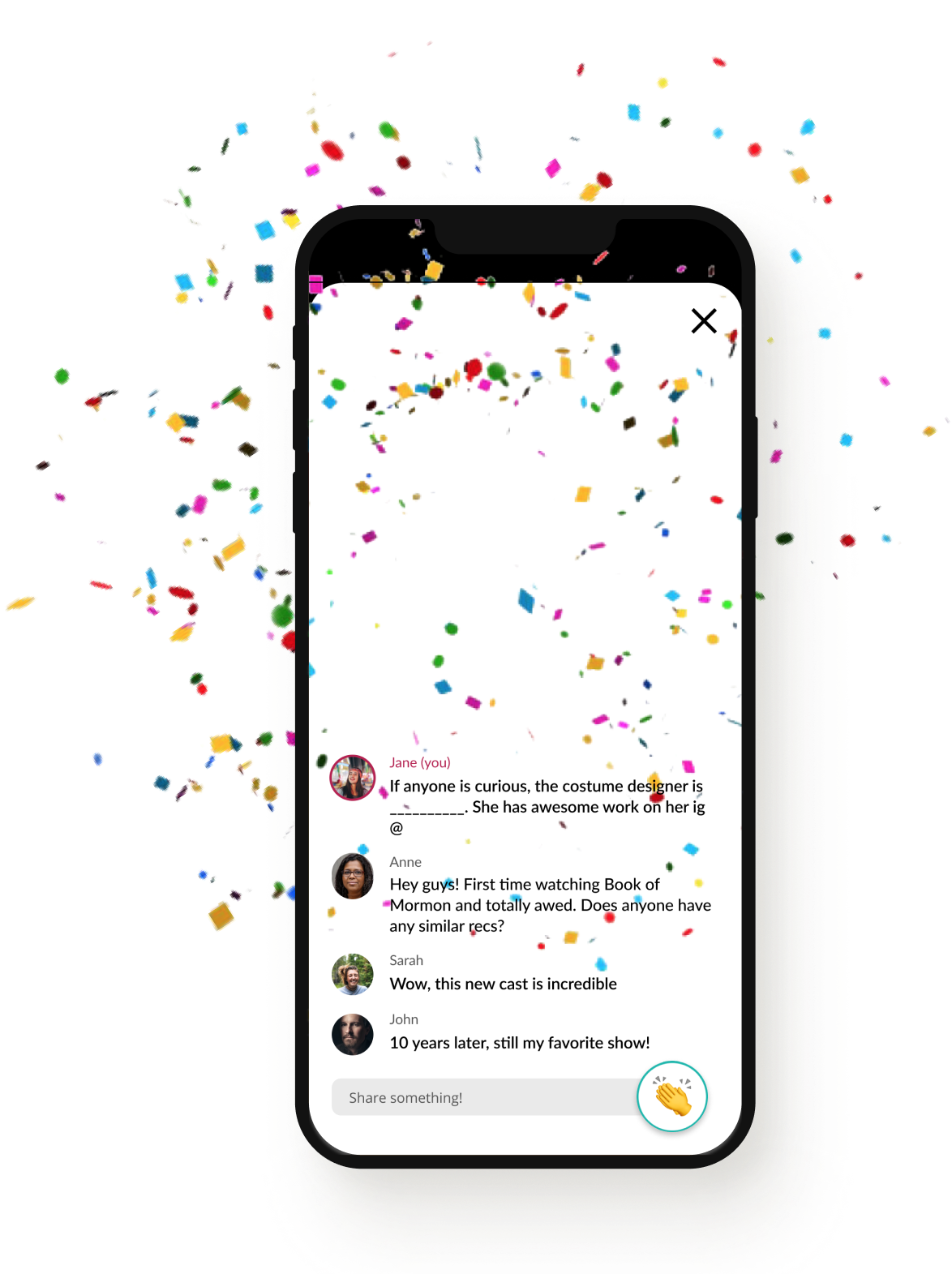
The PlayHouse MVP went live in December 2020 with the show opening of Ruddigore, presented by Harvard-Radcliffe Gilbert & Sullivan Players. This version of the app was focused on validating the need, usability and adoptability of the companion app during a live virtual show. Participants loved the live chat feature and particularly the applause feature.
We tracked and audience engagement with the applause feature with the built-in analytics feature and visualization to validate:
- Feature desirability
- Usability
- Engagement
Iterations and improvements
Learning from the MVP launch
Based on usability testing on 5 shows, PlayHouse updated the design to streamline the colors and provide more of a cohesive experience. An initial dashboard was added in a list format so that users could simply view the upcoming shows. In the future, the Playhouse team intends to implement the floor dashboard so users can keep up with their favorite venues at scale.
Below, the updated and live(!) PlayHouse stills:

reflection
PlayHouse was my first experience working end-to-end on design for a startup
I came up first hand with technical constraints and was able to see a product I designed ship and test with users. I particularly relished in playing on users' mental models with the information architecture and bringing life and energy into the design system of an app whose core purpose is to bring entertainment, delight, and community to users who were forced to separate during the pandemic.
In retrospect, I acknowledge that I was not as involved in the front-end discovery phase of initial user needs as I was in the final fit and finish of the design. Thankfully, I have plenty of other more research focused projects for you to explore!